Once you have set up your content, you can add inputs to your form. In all cases, you select where the input will be placed by clicking to place the cursor, and then clicking on the desired input type from the toolbar. This will bring up the dialog box for that input type, allowing you to customize the information about the input.
For information on the Control Settings on each input, please see the Advanced Functions section.
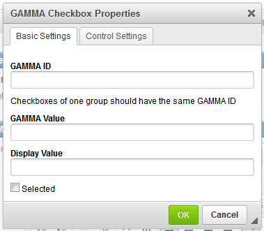
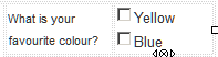
Checkboxes
Checkboxes are inputs which allow the user to select multiple answers within a defined group.
|
GAMMA ID is the ID given to the group of checkboxes to link them together as the options for one piece of information. GAMMA Value is the value returned in the response to you if the checkbox is selected when the form is submitted. Display Value is the checkbox label which will be displayed to the user. Selected indicates the checkbox will be pre-selected when presented to the user in the form.
|
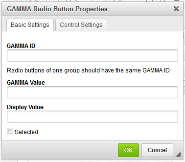
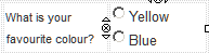
Radio Buttons
Radio Buttons are inputs which allow the user to only select one option from a defined group.
|
GAMMA ID is the ID given to the group of radio buttons to link them together as the options for one piece of information. GAMMA Value is the value returned in the response to you if the radio button is selected when the form is submitted. Display Value is the radio button label which will be displayed to the user. Selected indicates the radio button will be pre-selected when presented to the user in the form.
|
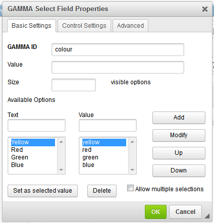
Select Field
A Select field allows a user to select either one or multiple options from a pre-defined list.
|
GAMMA ID is the name given to the field. In the Available Options, define the label to display to the user (Text) and the value to be sent back if it is selected (Value) and click Add to add them to the pre-defined list. Modify allows you to modify an option that has already been added - select the option, make your change then click Modify. Up and Down allow you to change the position of an option in the list. Set as Selected Value will make that option the default (pre-selected) option in the dropdown when it is presented to the user. If left blank, the first value in the list will be presented. Delete will remove the selected option Allow Multiple Selections allows you to toggle if the field will only allow a single response or multiple responses.
|
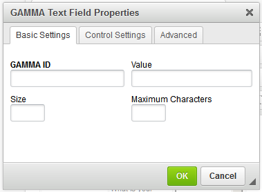
Text Field
Allows the user to enter in plain text.
|
GAMMA ID is the name of the field. Value is the pre-filled (default) value presented to the user (if required, leave blank for none) Size is the number of characters long for the text field to appear. Maximum Characters is the limit on how many characters the user can enter into the field.
|
Textarea
Provides a bigger text area for plain text input. It can also be resized.
|
GAMMA ID is the name of the field. Columns is the number of characters wide the textarea should appear by default Rows is the number of lines long the textarea should appear as default Value is the pre-filled (default) value presented to the user (leave blank for none)
|
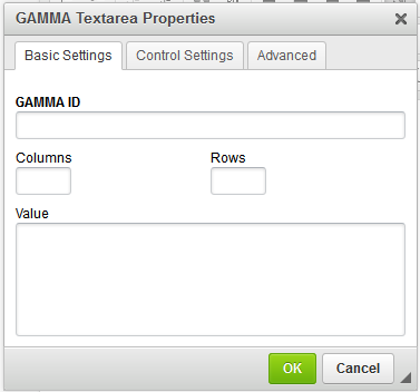

Image Input
Allows the user to add an image input to the workflow. Please note that adding image input is different from Adding Content-Image as adding image content is to send an image as a part of the workflow, while adding image input as described here to allow the recipient to add image in their responses. To be able to add an 'Image Input' in your interactive message, click on  button on top of the HTML editor and add the below section to the code:
<div gamma:id="img" gamma:image=""> </div>
Note that if you add an image input to the workflow message, you must use application/json for the response type. As discussed in Creating Workflow Messages, you may add application/json by either of the two methods:
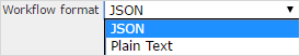
•Set Interactive Message Content > Workflow Format to JSON.
•Or click on the message editor and add <gamma:format="application/json"> to the gamma header.
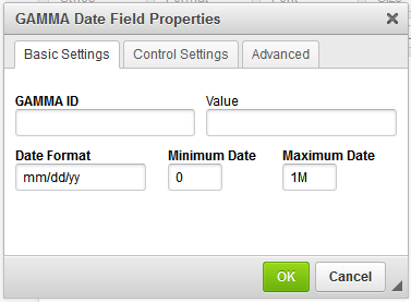
Date Field
Allows the user to select a date. A calendar will pop up in the message to allow selection.
|
GAMMA ID is the name of the field. Value is the pre-selected (default) date to be presented to the user (leave blank if none) Date Format allows you to determine the format to display the date. Minimum Date and Maximum Date allow you to define limits to the date that can be selected. Eg: -1M in Minimum and 1M in Maximum will restrict selection to one month on either side of today's date. Use D, M or Y for the appropriate unit of measurement. |
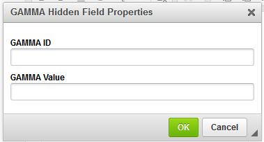
Hidden
Is not shown to the user, however returns the defined value in the response message.
|
GAMMA ID is the name of the field. Value is the data that should be returned by the field.
|
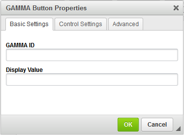
Button
Uses the Button tag to create a button. Buttons cannot be used as a point in a decision tree in an interactive message as they will immediately trigger a response to be sent. They should be used for submit-type inputs only.
|
GAMMA ID is the name of the button Display Value is the text on the button that will be displayed to the user.
|
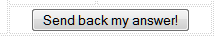
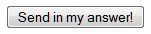
Input Button
Uses the input tag to create a button. Buttons cannot be used as a point in a decision tree in an interactive message as they will immediately trigger a response to be sent. They should be used for submit-type inputs only.
|
GAMMA ID is the name of the button Display Value is the text on the button that will be displayed to the user.
|