Drag and drop the Inbound Submit Button Field element into the Mobile Editor, to open up the form.
Click the topics to expand
Display Tab
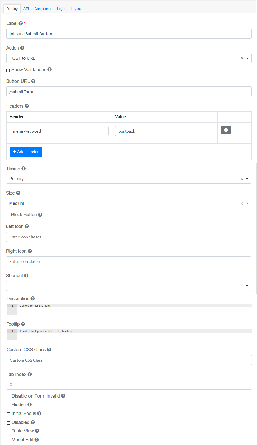
Label
|
Title of the Inbound Submit Button Field
|
Action
|
This is the action to be performed by this button.
|
Show Validations
|
When the button is pressed, show any validation errors on the form.
|
Button URL
|
The URL where the submission will be sent.
|
Headers
|
Headers Properties and Values for your request. Click on Add Header to add multiple headers.
|
Theme
|
The color theme of this button.
|
Size
|
The size of this button.
|
Block Button
|
This control should span the full width of the bounding container.
|
Left Icon
|
This is the full icon class string to show the icon. Example: 'fa fa-plus'
|
Right Icon
|
This is the full icon class string to show the icon. Example: 'fa fa-plus'
|
Shortcut
|
Shortcut for this component.
|
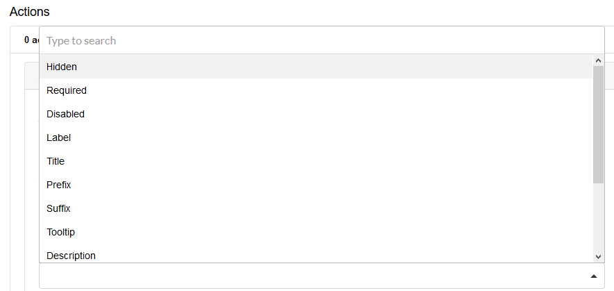
Description
|
The description is text that will appear below the input field.
|
Tooltip
|
Adds a tooltip to the side of this field.
|
Custom CSS Class
|
Custom CSS class to add to this component.
|
Tab Index
|
Sets the tabindex attribute of this component to override the tab order of the form. See the MDN documentation on tabindex for more information.
|
Disable on Form Invalid
|
This will disable this field if the form is invalid.
|
Hidden
|
A hidden field is still a part of the form, but is hidden from view.
|
Initial Focus
|
Make this field the initially focused element on this form.
|
Disabled
|
Disable the form input.
|
Table View
|
Shows this value within the table view of the submissions.
|
Modal Edit
|
Opens up a modal to edit the value of this component.
|
|
API
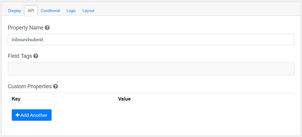
Elements to be included for the API part of the message.
Property Name
|
The name of this field in the API endpoint.
|
Field Tags
|
Tag the field for use in custom logic.
|
Custom properties
|
Users configure any custom properties for this component. Use Add Another button to add more than one key.
|
|
Conditional
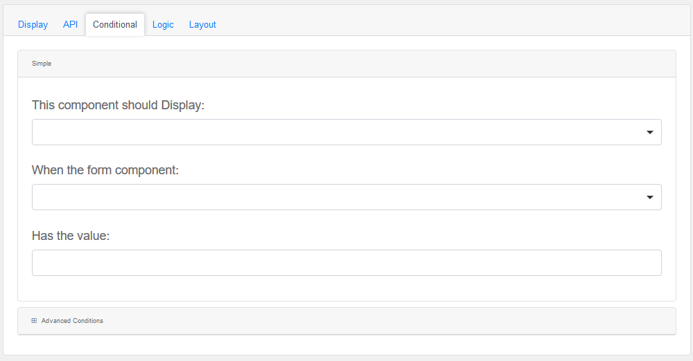
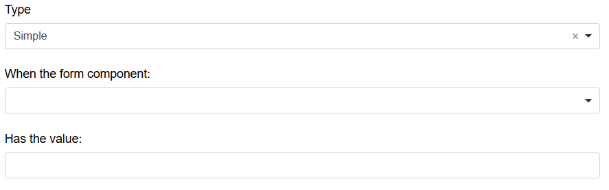
Simple
|
This component should display
|
Choose True or False
|
When the form component
|
Choose Submit
|
Has the value
|
Add a valid Value
|
Advanced Conditions
|
The following variables are available in all scripts.
|
Logic
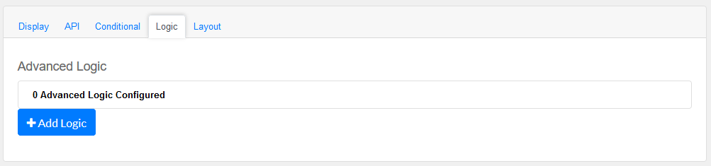
Add certain logical information to the Message.
Start by choosing the Add Logic button.
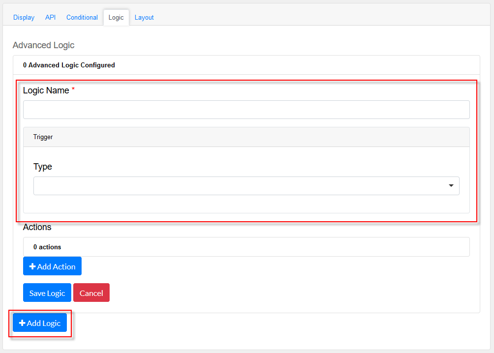
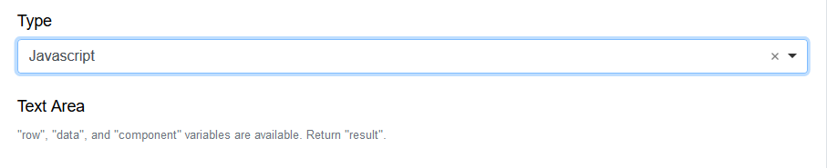
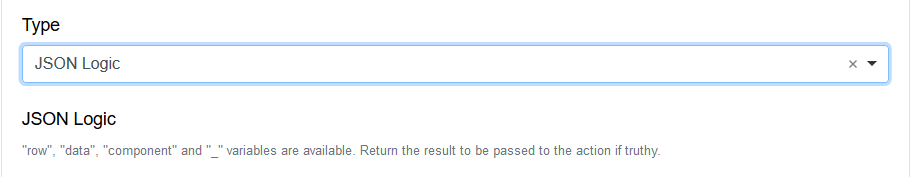
Enter a Logic name, and choose a type namely :
Simple
|
|
Javascript
|
|
JSON Logic
|
|
Event
|
|
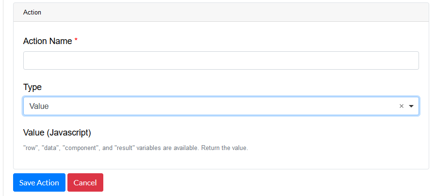
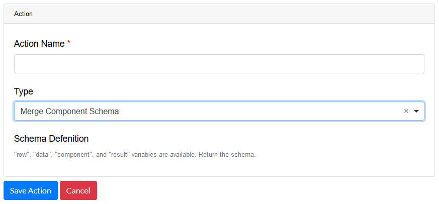
Next, add an Action.
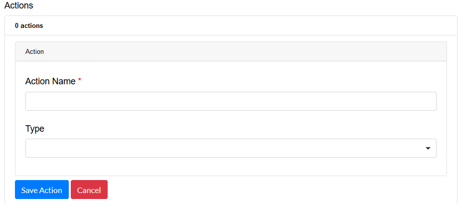
Enter an Action Name and choose a Type.
Property
Choose a a property type
|
|
Value
Choose type Value to use an appropriate Java Script
|
|
Merge Component Schema
|
|
|
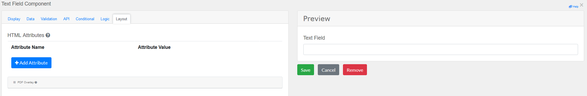
Layout
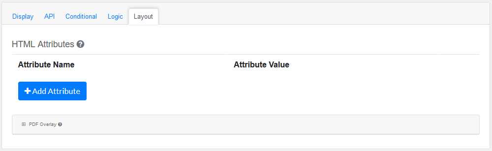
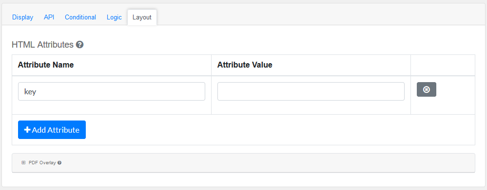
This section provides a map of HTML attributes for a component's input element.
Note: Attributes provided by other component settings or other attributes generated by form.io take precedence over attributes in this grid.
Click on Add Attributes to add an Attribute Name and Attribute Value.
PDF Overlay, is exclusively for PDF Forms only.
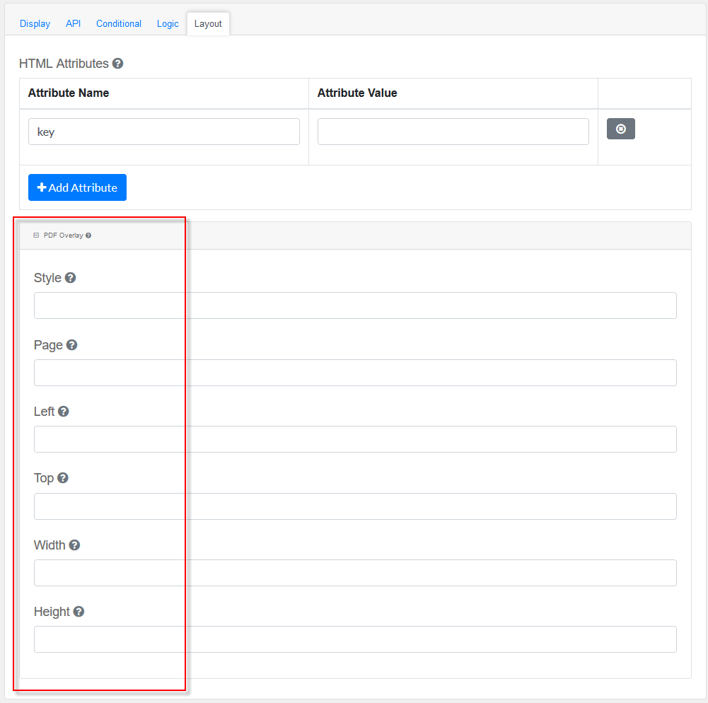
Style: Custom styles applied to this component when rendered in PDF.
Page: The PDF page to place this component.
Left: The left margin within a page to place this component.
Top: The top margin within a page to place this component.
Width: The width of the component (in pixels).
Height: The height of the component (in pixels).
|