Drag and drop the File Field element into the Mobile Editor, to open up the File form.
Click the topics to expand
Display Tab
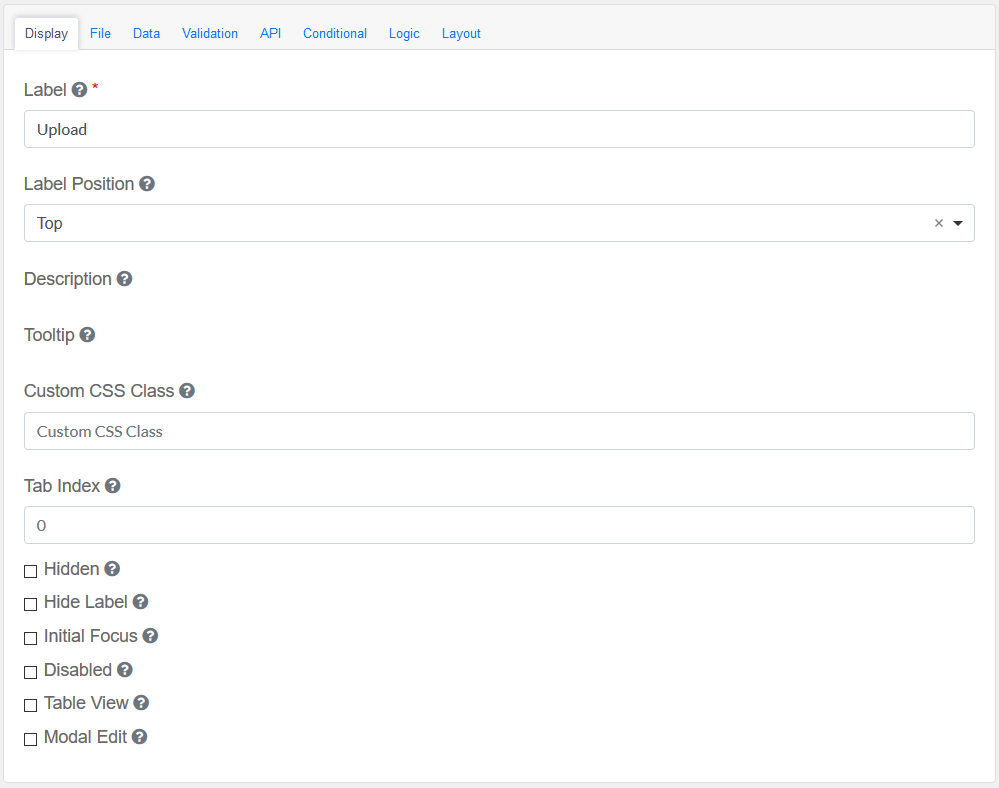
Label
|
Title of the File Field
|
Label Position
|
Decide where the label is positioned in the File Field
|
File
|
The File to be used with this field.
|
Description
|
The description is text that will appear below the input field.
|
Tooltip
|
Adds a Tooltip to this field
|
Custom CSS Class
|
Add a custom CSS class
|
Tab Index
|
Sets the tabindex attribute of this component to override the tab order of the form. See the MDN documentation on tabindex for more information.
|
Check-Box Options
|
Hidden : Add hidden components within the Container Field
Hide label: Hides the label of the Container Field Element
Initial Focus : Focus this field
Disabled : Disable this Container Field
Table View : Shows this value within the table view of the submissions.
Modal Edit : Opens up a modal to edit the value of this component.
|
|
File
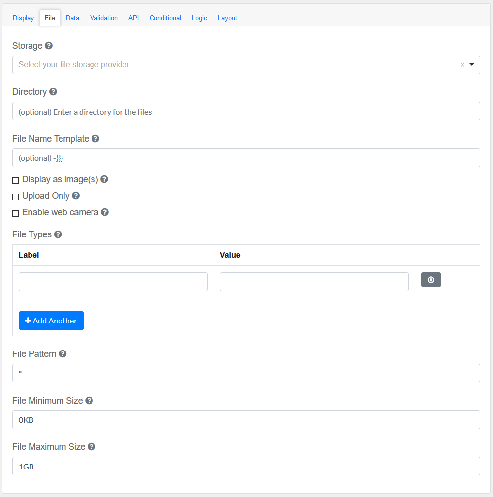
Storage
|
Select which storage to save the files in.
|
Directory
|
This will place all the files uploaded in this field in the directory
|
File Name Template
|
Specify template for name of uploaded file(s). Regular template variables are available (`data`, `component`, `user`, `value`, `moment` etc.), also `fileName`, `guid` variables are available. `guid` part must be present, if not found in template, will be added at the end.
|
Display as image(s)
|
Instead of a list of linked files, images will be rendered in the view.
|
Upload Only
|
When this is checked, will only allow you to upload file(s) and consequently the download, in this component, will be unavailable.
|
Enable web camera
|
This will allow using an attached camera to directly take a picture instead of uploading an existing file.
|
File Types
|
Specify file types to classify the uploads. This is useful if you allow multiple types of uploads but want to allow the user to specify which type of file each is.
|
File Pattern
|
See https://github.com/danialfarid/ng-file-upload#full-reference for how to specify file patterns.
|
File Minimum Size
|
See https://github.com/danialfarid/ng-file-upload#full-reference for how to specify file sizes
|
File Maximum Size
|
See https://github.com/danialfarid/ng-file-upload#full-reference for how to specify file sizes.
|
|
Data Tab
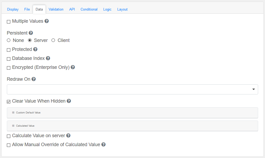
Configure the date and its properties.
Multiple Values
|
Allows multiple values to be entered for this field.
|
Persistent
|
A persistent field will be stored in database when the form is submitted.
|
Protected
|
A protected field will not be returned when queried via API.
|
Database Index
|
Set this field as an index within the database. Increases performance for submission queries.
|
Encrypted (Enterprise Only)
|
Encrypt this field on the server. This is two way encryption which is not suitable for passwords. Only valid for Enterprise GSMS Users.
|
Redraw On
|
Redraw this component if another component changes. This is useful if interpolating parts of the component like the label.
|
Clear Value When Hidden
|
When a field is hidden, clear the value.
|
Custom Default Value and Calculated Value
|
A set of variables available in all scripts.
|
Calculate Value On Server
|
Checking this will run a calculation on the server. This is useful when there is a need to override the values submitted with the calculations performed on the server.
|
|
Validation
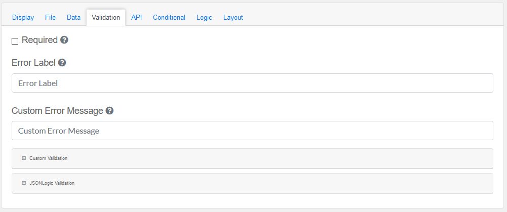
Validate the data within the Container Field
Required
|
A required field must be filled in before the form can be submitted.
|
Error Label
|
The label for this field when an error occurs.
|
Customer Error Message
|
Error message displayed if any error occurred.
|
Custom validation and JSONLogic Validation
|
The following variables are available in all scripts.
|
|
API
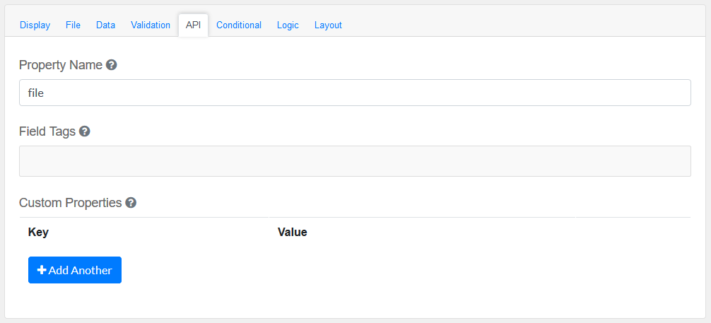
Elements to be included for the API part of the message.
Property Name
|
The name of this field in the API endpoint.
|
Field Tags
|
Tag the field for use in custom logic.
|
Custom properties
|
Users configure any custom properties for this component. Use Add Another button to add more than one key.
|
|
Conditional
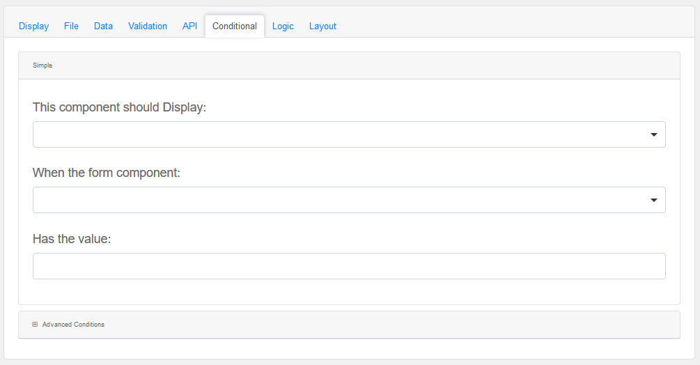
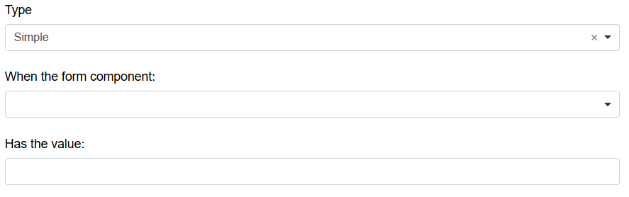
Simple
|
This component should display
|
Choose True or False
|
When the form component
|
Choose Submit
|
Has the value
|
Add a valid Value
|
Advanced Conditions
|
The following variables are available in all scripts.
|
Logic
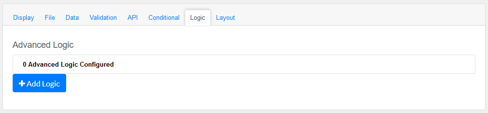
Add certain logical information to the Message.
Start by choosing the Add Logic button.
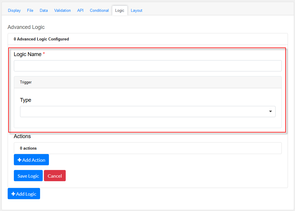
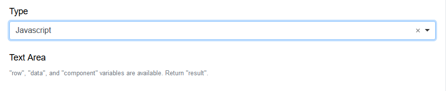
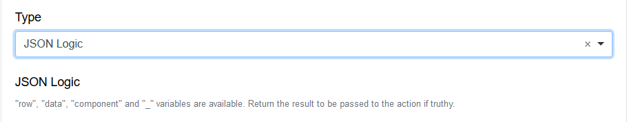
Enter a Logic name, and choose a type namely :
Simple
|
|
Javascript
|
|
JSON Logic
|
|
Event
|
|
Next, add an Action.
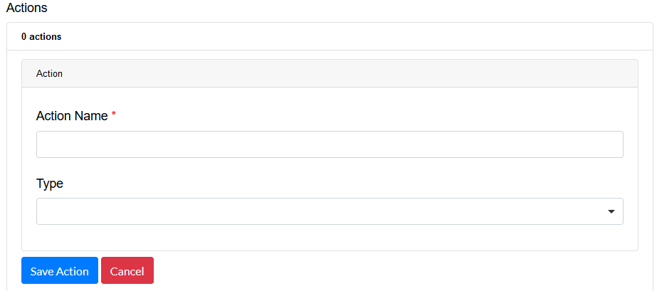
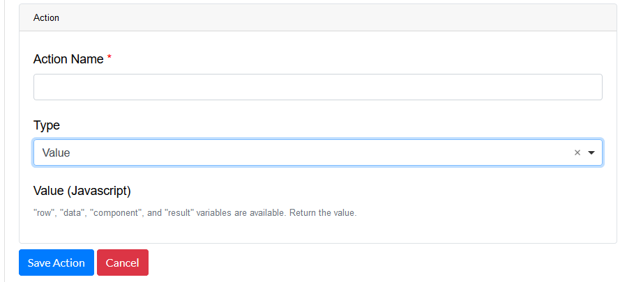
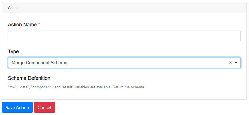
Enter an Action Name and choose a Type.
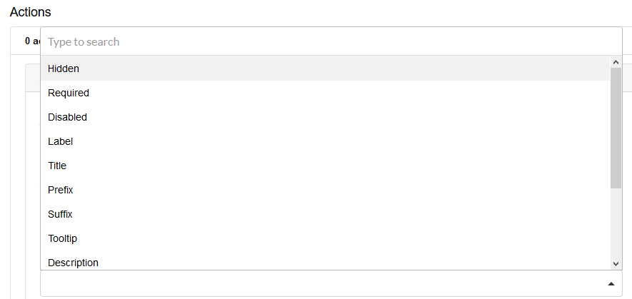
Property
Choose a a property type
|
|
Value
Choose type Value to use an appropriate Java Script
|
|
Merge Component Schema
|
|
|
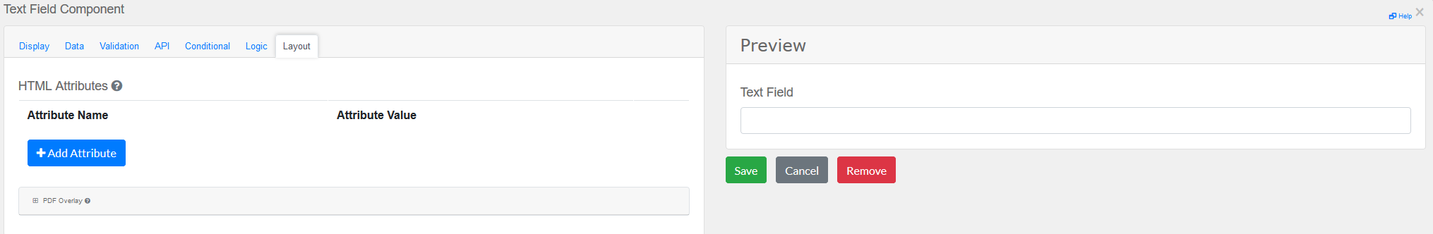
Layout
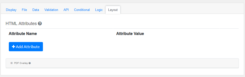
This section provides a map of HTML attributes for a component's input element.
Note: Attributes provided by other component settings or other attributes generated by form.io take precedence over attributes in this grid.
Click on Add Attributes to add an Attribute Name and Attribute Value.
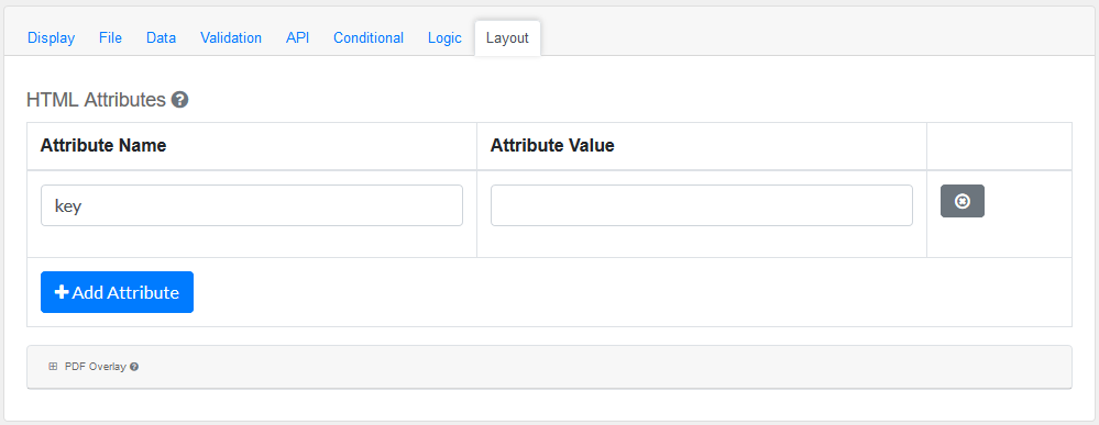
PDF Overlay, is exclusively for PDF Forms only.
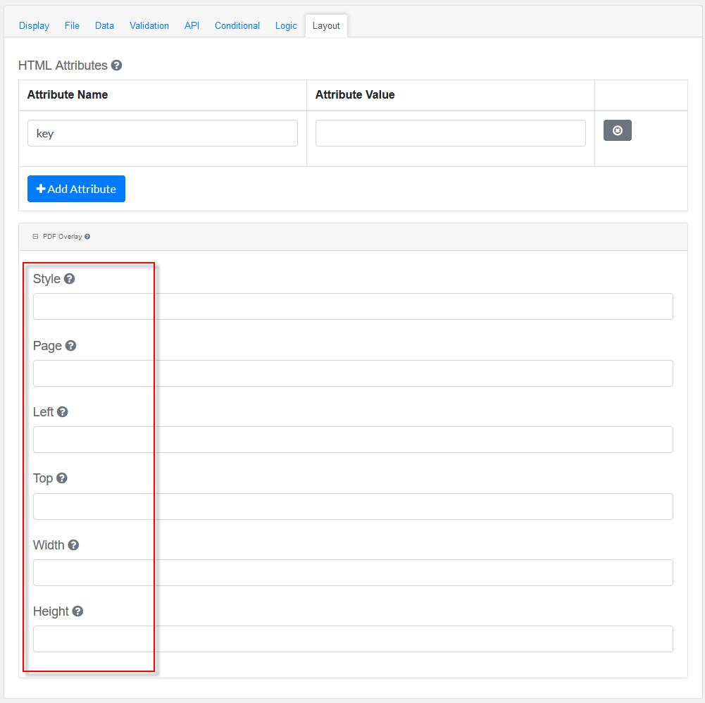
Style: Custom styles applied to this component when rendered in PDF.
Page: The PDF page to place this component.
Left: The left margin within a page to place this component.
Top: The top margin within a page to place this component.
Width: The width of the component (in pixels).
Height: The height of the component (in pixels).
|